Soft shapes create well-being
Imagine if tennis balls were square and pillows hard and box-shaped. Maybe tennis had become a popular sport and the sofa had become the place as an attractive place to relax? Soft shapes are found all around us; especially out in nature. Now they are getting more space in the interior design of companies.
Last month, we unfolded our thoughts on why acoustics are a crucial - but often overlooked - element in interior design of spaces that should invite certain types of (positive) behaviors. Today, we tackle another important branch of interior design: design and visual expression.
Therefore you should use more soft forms
We were briefly into the pillow and the tennis ball as forms that are functional and accommodating. Soft shapes are not only better in specific use situations - generally speaking, soft, organic elements make people feel more comfortable. In this way, the soft shapes, like the acoustics, also become a factor that promotes positive behavior.
For example, company employees become more creative and productive when the framework supports the behavior. And the restaurant's guests recommend and come back when the environment is nice and support the other well-thought-out elements of the experience.
Copy paste nature!

In nature, it is the soft curves and organic shapes that predominate. Trees, shrubs, leaves and raindrops are rounded.
When it comes to nature, in fact, only defense mechanisms have an angular expression: sharp claws, spikes and rows of teeth signal "stay away", not "welcome to".
When the talk falls on interior design, we therefore often refer to the well-being you feel after a walk in the woods. And if the goal is a welcoming and positive expression in the decor, it is natural to let the inspiration come from nature in shapes, colors and material choices.
Case: A friendly welcome
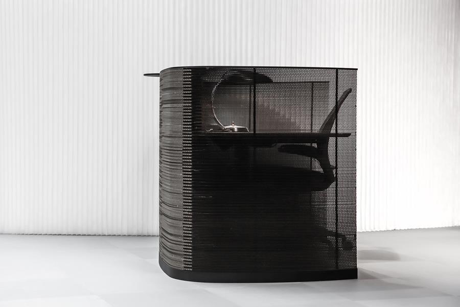
When Grape designed Impact reception for Surftown's new interior design in the Park a few years ago, it was out of a desire to create a first impression based on friendly vibes and friendliness.
We experimented with different elements in the area and arrived at the soft, single-curved lines in white Corian® as a nice and clean contrast to the plant wall in the area.
A classic square reception desk did not seem friendly and inviting at all - and it looked cluttered when it had to stand a little sloping in the room, which was a wish, to provide an overview and contact to people on their way in and out. the House.
Our work with such projects gives us tangible experiences of how soft shapes contribute to a positive experience of the famous “crucial first five seconds”, and thus new visitors' overall long-term impression of the company. So if you need a place to start with the "organic design", we highly recommend the company's reception areas.
The sharp lines as a supplement
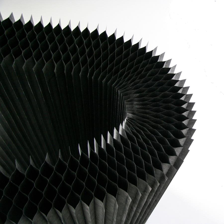
We're just saying that there is good reason to think about other than boxes and edges in your next decor - with the new production methods and designs, soft shapes do not cost much extra. So an idea could be to start with the soft shapes and supplement with the lines where it gives effect or greater functional value.
The contrast between soft shapes and sharp edges is exciting, and something we cultivate ourselves. Especially with our own Impact solutions and the award-winning products from our friends in Vancouver; molo. It has given Grape's DNA some intriguing, stylistic contrasts. Something that, incidentally, is also recognized from other industries that are skilled at design; just think of how modern cars are increasingly combining curves and edges.
It's not just us
When we look around the rest of the design world and architecture, it is clear that the round shapes are more frequently used to make our surroundings more attractive. That's why we think it's interesting to include some examples in this article.
Axel Towers
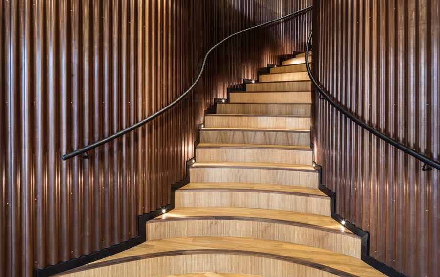
" A building that, in thought and form, is made sensual and welcoming, with intimately embracing and anchoring spaces, and at the same time outward-looking and tantalizing spatial contexts, inside and out. Axel Towers is experienced with its curved shapes soft and inviting in meeting the city and the people moving in and around the building ".
CNN article - Ma Yansong “Why curves matter”
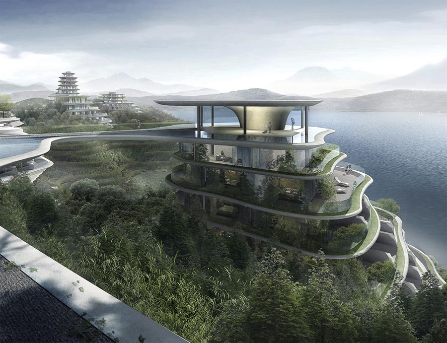
And it's not only at Grape we feel drawn to the soft curves. For example, my wife stumbled upon an article and film clip on CNN on Monday, where one of China's top architects Ma Yansong (MAD Architects) also unfolds on the subject. He, like us, draws nature into the equation. If you travel to China, you will already be able to see how the sky-line is changing.
molo cloud softlight
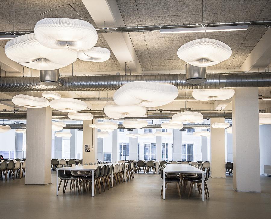
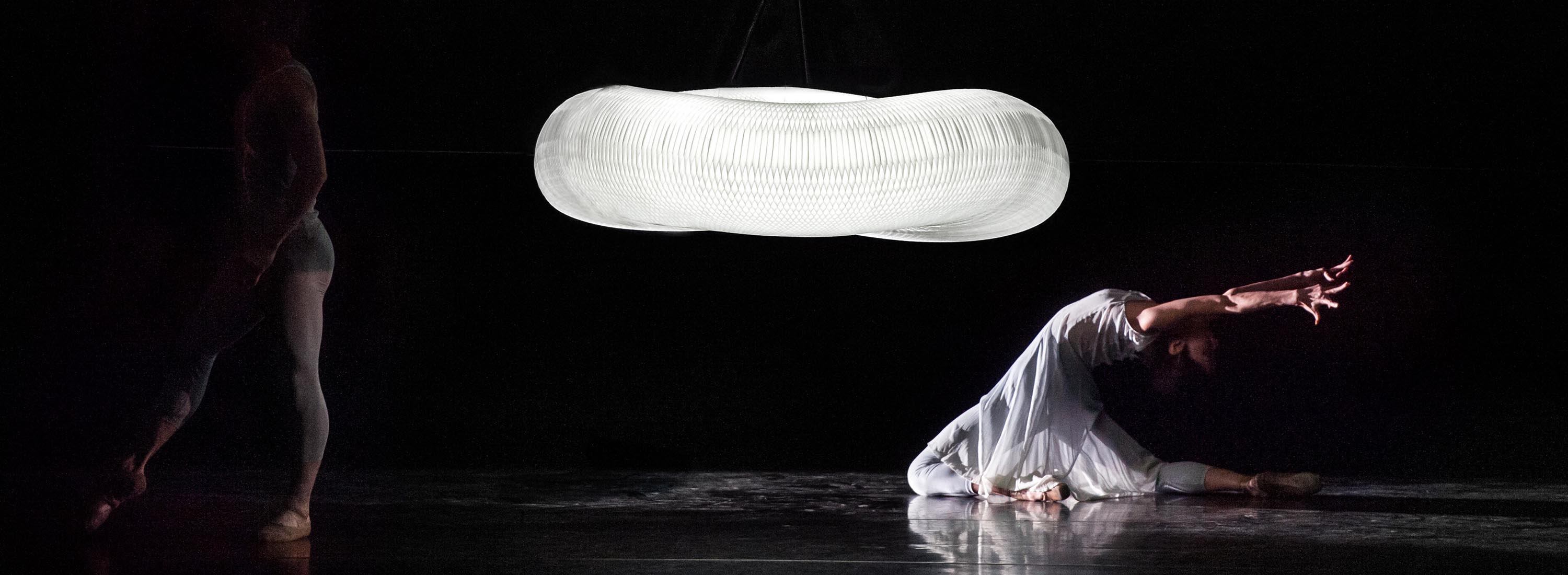
molo from Vancouver has won several international awards for their talented play with materials and shapes. All of Molo’s room dividers, lamps and furniture are built on the same honey-comp structure that unites repeated sharp edges into soft round and wavy shapes. The result is solutions that both enhance the acoustics and add space to human softness. For example, Josephine Malling used the cloud lamps (pictured) to soften up a canteen at KEA that had otherwise become a little too industrial and cold.
Grape Box sofa
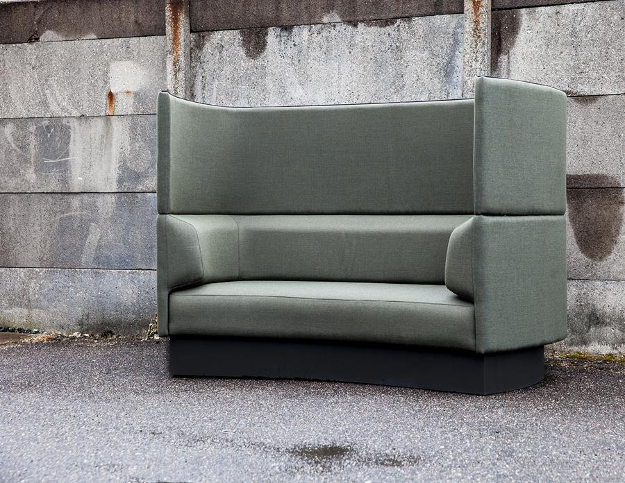
From ourselves, I would like to highlight the Grape Box sofa as the last example. It arose a bit like an urge when a receptionist sat behind a newly set up Impact reception and remarked "you could also sit in it". And man how was she right! Precisely the soft inward-facing sides give an extra feeling of security and comfort. In doing so, it invites small informal talks about the world situation or new ideas. Far more inspiring and intimate than similar square models.
Device that supports positive behavior
In Grape, we focus on devising interior design solutions that play with the behavior desired in a room. If there is a need for creative thinking over box thinking, then space must reflect that. If the decor looks like something that could have been drawn in an excel sheet, then it just does not tend to "think out of the box".Similarly, areas of customer contact - receptions, restaurants and shops - have also started to implement a more welcoming style, which pleases us. Because it sets the stage for a more friendly and humane interaction.
We invite you to a dialogue
Anyone who wants dialogue is welcome. So finally give me a call (mobile +45 40 646 100) or return this email if you have something on your mind or for example would like to hear more about how Grape can contribute to a decor nearby. If you want to look past our design studio, call a few days in advance so we can put the coffee over.
Sincerely,
Christian Nygaard, Designer & Partner, October 2017
